
User Experience (UX) plays a pivotal role in attracting and retaining users. One critical aspect of UX is how content is loaded and presented to users during their interactions with the app. This process involves a series of steps, from a user's action to the final view of the desired outcome.
In this blog post, we will delve into the concept of UI interactions, the significance of performance-oriented content loading, and how to avoid common pitfalls that can negatively impact user engagement. With a focus on optimizing wait times and creating a smooth experience, we will explore real-life examples and what tools can help designers and engineers identify and rectify performance issues efficiently.
Let's dive in and explore the world of mobile UX design with a performance-driven approach.
What are UI interactions?
A user sees and feels UI when interacting with a mobile app.
UI interactions refer to any time a user interacts with the screen of their mobile device to achieve a desired outcome in an app.

1) The first step is a user action. This could be anything from a tap to a scroll, a swipe, etc. The action refers to any action that the user takes to interact with the UI
2) The second step is a UI Change. The UI change occurs due to the user’s action (or interaction with the UI of a mobile app). Once a user completes the action, the UI will update to reflect that. This update could be:
- an animation (a cyclic loader or a transition animation to a new page)
- layout update
- Splash screen where we just see the logo of the app, which usually occurs during the app starts right after the app has launch
3) The last step is the reaction, which is usually the final view of the outcome that the user is trying to achieve with their initial action.
The wait time spans across the entire flow. This wait time represents how long the resulting reaction loads on the screen after users interact with an app’s UI. Wait time should not be confused with loading time because it measures all the time between the action and reaction, not just the amount of time it takes to load the final view after the UI change occurs.
Here’s an example of such interaction: An image is selected from the profile feed, and as a result, we see the dedicated post for the image.
%20(1).gif)
- The action is a user selecting the image from the profile feed.
- The UI Change is the animation that occurs to open and show the post.
- The Reaction is the view of the post’s dedicated page.
This UI interaction is a smooth experience for the user because there are no delays. The data for the selected photo was prefetched, which is why the final view appears almost instantly.
But some UI changes occur when a UI-Interaction can not be so smooth. In particular when additional data needs to be loaded to show the final view. In this case, it is harder to predict user wait time because it depends on how and when the data is loaded. However, to communicate to the user that their action was successful, that needs to be indicated on the screen while the data is loading.
How to keep users engaged and show them that progress is being made without creating extra wait time?
Now that we know the flow of action -> UI change -> reaction, let’s look at some examples of bumpy UI changes to highlight the problems with keeping UX design and performance aligned.
Example 1. Loader
As shown in the video, when a user taps to select an event, we see a transition animation and a loader, and lastly, the UI updates - we see the event details.
.gif)
Loaders are great for indicating to the user that data is being loaded. Still, they also indicate to users that they are waiting for something and not giving any information on progress. If a loader lasts longer than it should and no additional UI changes occur, it can annoy users and make them feel as if the app is frozen or stuck.
Example 2. Transition animation
Transition animations are a great way to show progress and keep the user engaged while waiting for any necessary data to load for the final view.
The downside is that it can be hard to match the total wait time to the length of the transition animation because transition animations are usually quick.
In the GIF below, a user swipes to purchase an item. Then, we see a long pause followed by a transition animation and a blank screen. After all of that, we finally see the order placed screen.
.gif)
In this case, the user experiences a lot of delays when trying to purchase an item, not only in waiting for the transition animation but also further delays after the transition has been completed before the user receives confirmation.
Example 3. Layout updates and additional content loading
Layout updates give users feedback, showing visual progress that the content is loading. However, having a lot of layout updates in one flow can create a jumpy experience for a user.
In this example from another popular e-commerce app:
- a user selects the app to launch it
- we see a splash screen with the logo, a blank layout
- multiple layout shifts to indicate progress to the user before the content is loaded on the screen for the final view.

In this case, the splash screen and multiple layout updates communicate to the user that they have been waiting for something to load, which can take away from a smooth user experience.
Why is performance-oriented UX design important?
- It affects brand preference. 52% of users are less likely to interact with a brand if they had a poor experience with its mobile app. This indicates that the mobile app’s performance plays a huge role in either helping to acquire or lose customers.
- It affects brand reputation. 36% of users who have experienced slow performance issues had a lower opinion of the company. If a user tries to use a mobile app riddled with delays, that would leave a negative impression.
- It affects customer retention. 96% of users say app performance (speed or responsiveness) matters when deciding to keep or delete an app from their mobile device.
The problem. Performance is challenging
There are a lot of different tools that help engineers with post-production app performance optimization. But, without the preproduction tools, delays are often discovered in the production when they are already launched to the users. It would be easier to spot delays with observability tools, but just knowing the delay exists won't help a core cause of the delay.
User experience is not always clearly tied to specific code events. For example, the tap on the screen can be registered by the phone at a different time when your app will recognize the tab (and there can be a load of stuff going on there). As well as the place where the last image (or frame) is ready to be rendered and the place when it is rendered and appears on the screen, there also can be a time gap between them. Tracking specific metrics of what the user sees takes a lot of work.
Many tools that provide different metrics would only sometimes be tied to the user experience and often reflect the confusion of loading in time with wait time. One thing we see across different mobile apps and as an explanation of something loading slowly is the slow backend (the slow work on the server), but that loading time is often different from the time the user has to wait. We must ensure that we're always minimizing the additional wait time on the phone.
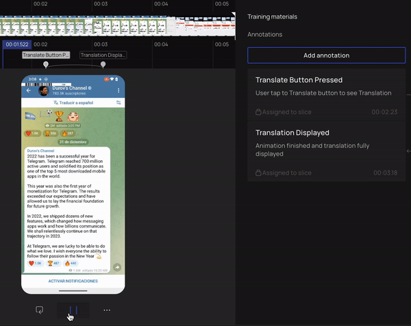
Here is where the opportunity and PS Tool come into place. PS Tool:
- Synchronises code events with screen recording
- Shows dependencies between code
- Highlights delays and their cause
We have observed that applications across diverse industries and platforms often experience significant delays that can be easily fixed. These delays come not from some complicated libraries or technical issues but because of the interactions between the front- and backend, with UX elements, the additional data loading, and other code that runs in the background.
The causes of these delays can be split into two categories:
Category #1. Not starting to fetch data as soon as possible, waiting for some additional UI updates:
- Showing “blank” layout and then loading data
- Waiting for an animation to finish and then loading data
Category #2. Not showing data immediately when it is available (waiting until all data is available before loading it on screen)
Example. Flink vs Robinhood
Here is a comparison of two similar apps (they are dedicated to trading stocks on phones) and their very similar page-loading process. When a user clicks on a company for trading stocks:
- the company detail page loads
- user see some details about that company and the plot of how the stock price changes
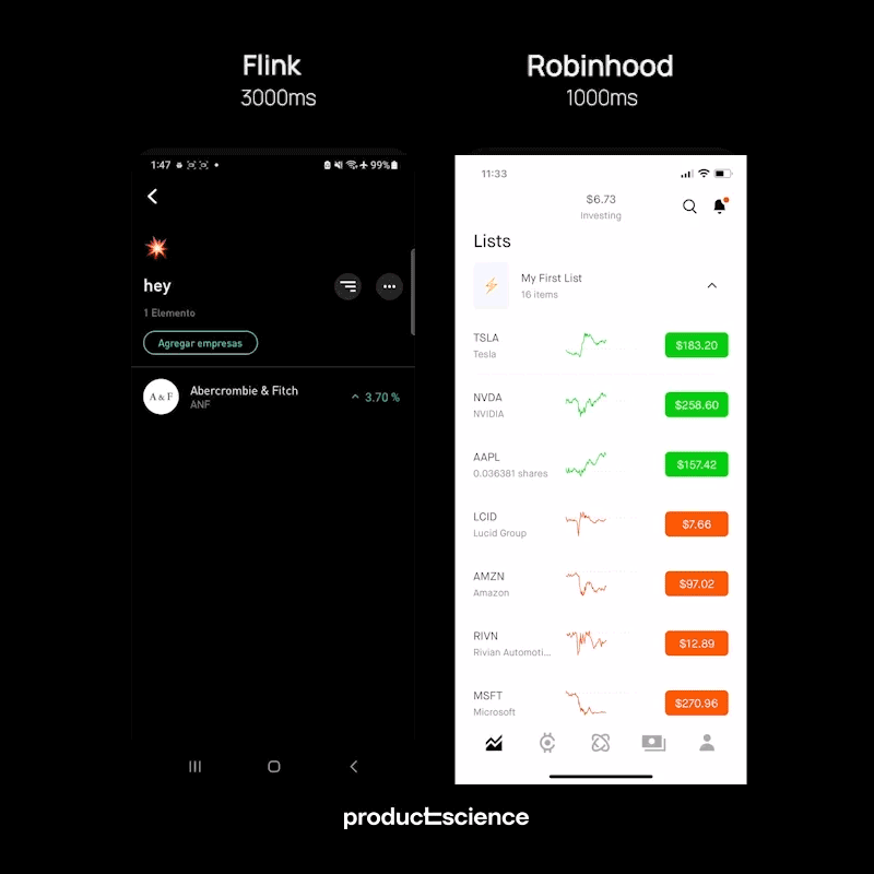
The video above takes Flink to show the “Company Details” page for almost three seconds, while Robinhood does it for as little as one second.
In the meantime, it is not always possible to directly compare different apps and their backends and make assumptions about their backend conditions being identical.
Frequently, when users experience delays in the user interface on their phones, it is common to attribute these delays to a slow backend, particularly during periods of high load. However, this is not always the case, and even if it is, it may only partially explain the issue. Mobile performance optimization should consider not just the backend but also the interplay between UI updates and loading processes.
Let's dive deeper into the example of Robinhood and see how the loading happens there.
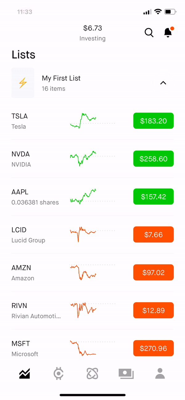
- The transition animation is shown while the data is loading
- This is an efficient use of a design element (the transition animation) to keep the user engaged while the data is loading
- There is a moment when the user waits for the data to finish loading, but it is a very short amount of time
Robinhood starts to fetch the data to appear on the screen when the user clicks on the company - it is known which company they will open, so Robinhood is ready to fetch all the data. Once this data arrives without any further ado, it appears on the screen.
Let's dive deeper into the example of Flink and see how the loading happens there.

It is very similar to the UX design stage:
- user clicks on the company
- transition animation
- showing no chart data available and then populating the data much later also indicates a significant lag to the user
- users wait at least another 3 seconds before the chart loads
- chart update is delayed - data likely fetched late or waiting for the UI to update
- after a while, the data (including that plot) appears on the screen.
- chart data is the last to be loaded.
There are two reasons for the data to appear a bit slower that is not tied to the backend updates:
- Data is being fetched only after some UI update happens (in this case, it would be the end of the transition animation). Remember that if you only start to fetch the data after the animation ends, you're creating a wait time there by default.
- Not showing data as soon as it arrives, and in this particular case, there are two views for Flink stock price plot representation (line or candlestick chart). The Candlestick view is not visible on the screen. However, it's being fetched after this plot is loaded (but the data waits to appear on the screen until all the data is being fetched). So that creates extra wait time for the user, and once this is removed, the performance speeds up.
How to avoid these delays when designing
1) Start by thinking about the wait time that you need to cover. The purpose of all these intermediate steps would be to cover the wait time and to give the user the most smooth and quickest experience simultaneously.
2) Make sure that any step/element of UI update is necessary. Once you have a list of the elements that you want to incorporate, make sure that each step you are not showing is not just for the design purpose but actually that there is a utilitarian use for that.
3) Communicate the purpose of each UI update between teams:
- to ensure that wait time is covered efficiently
- to ensure that it is clear what this update is covering
- how the wait time happens in parallel
- nothing is delaying the next step
Avoid thinking in steps:
- UI can be dependent on code events & data loading
- Code events should not be waiting for intermediate UI updates
We often see specific steps sketched in designing an app process: loading these data (or showing text) and then showing images. Usually, that looks as the diagram below:
- the user action causes some loading
- the code running in the background
- when the data is loaded, there will be a UI update

When that UI update happens (which can take a long time), loading some data will only happen next. The red arrow on this diagram is something that should not ever happen.
One thing to make sure about (especially in discussions between engineers, product, and UX-design teams) is to ensure nothing is holding back the loading process and the code running in the background. As shown in the diagram below:

- code started executing right after the user tapped on the screen
- when it finishes loading, the app can update the screen (it is ok to show progress)
- that should not postpone the further code execution in the background (the further loading process). So, code could be waiting out the blocks of code, but it should never wait for an intermediate UI update.
How to look performant without being performant?
You can use Product Matrix to predict the following user's action.
In the example above (that has also been shown before), the profile page is opened, and when the user clicks on the picture, there is no additional wait time to load this photo. That's not because the photo is loaded so quickly but because the Instagram team realized that if someone enters the profile page, they will likely open full-size images in the feed and then scroll up and down. They start pre-fetching all those images to be ready to show them when the user needs them.
- You can do that for the most common scenarios in your app or the most essential ones (that don't admit any delays).
- You don't even always need to wait for the user's action to start prefetching this data, but that would always be on the product side. The engineers who implement the code would not always know the next section. So that is again where the communication between the product, UX design, and Engineering team is essential.
Special Case: unblurring animation
Unblurring animation is an example of UX-element that we often see, but it stands out because it does not cover any waiting time for data to load. The significant part about unblurring animation is that when the user waits for the data to load (as shown in the video below), the user doesn't just get data to pop on the screen immediately. Still, it appears gradually, creating a smooth experience.

One thing to keep in mind is that:
- unblurring animation would always create some additional wait time between the gray layout and the data appearing on the screen in full brightness;
- unblurring animation would look great and super smooth on high-end devices, but this animation can be bumpy on low-end devices and take much longer than expected.
When utilizing it, make sure that:
- animation is short and happens briefly;
- you know your users and which phones they use (and you adjust the usage of this animation to the phone models that are most popular among your audience).
Conclusion
- Most delays come from late data loading tied to a UI update or not showing data when it is available.
- Real user experience often differs from multiple metrics collected by many observability tools.
- Even for engineers who wrote the code, finding the cause of the delay is overwhelming.
How can PS Tool help?
- No manual instrumentation is required. 10x less effort than manual instrumentation
- AI-based filtering. PS keeps what matters and is important for trace analysis. Even the most minor function without decreasing application performance
- Execution paths. PS technology makes it possible to identify a single, most critical execution path responsible for satisfying a specified user action.
- Video synchronization provides visual context for you and your teammate. Provide solid visual cues that demonstrate precisely how the app works for users or errors the app may receive that cannot be gained from the code alone.
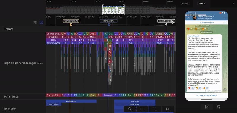
As easy as that, use screen recording to identify any visually noticeable delays, a spot where the animation ends, and when new data appears on the screen.
Select a frame, and in just one click, PS Tool will reveal the execution path - the sequence of events executed in the code leading to the chosen UI update. In this view, you can easily confirm your animation happened in parallel with data loading or delayed, and the new data appeared on the screen right after it was fetched or if it was delayed by something else.
Stay tuned by following us on LinkedIn.
Mobile Developer? Sign up for Product Science's mobile performance newsletter.
